Empowering citizens all around the globe to make their city a better place
Role
End-to-end Product Designer
Timeline
4 weeks
Responsibilities
User research
UI Design
Prototyping
User testing
Motion design
Tools
Brain
Figma
Jitter
Illustrator
Project background
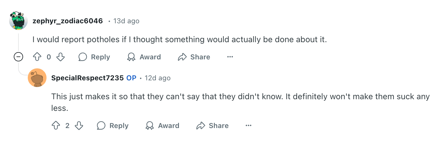
From insightful solutions to passionate discussions, there's no shortage of ideas for improving our cities. But what's keeping us from turning those ideas into action?
Research
I kicked off the process with thorough desk research, diving into articles, competitor insights, and Reddit discussions. To deepen my understanding, I conducted interviews with a mix of potential users of small to large cities in the EU and the US. I also got the opportunity to talk with an urban city planner.


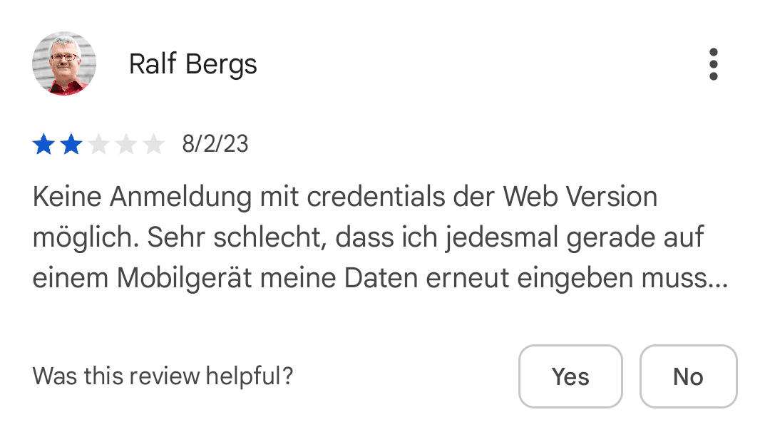


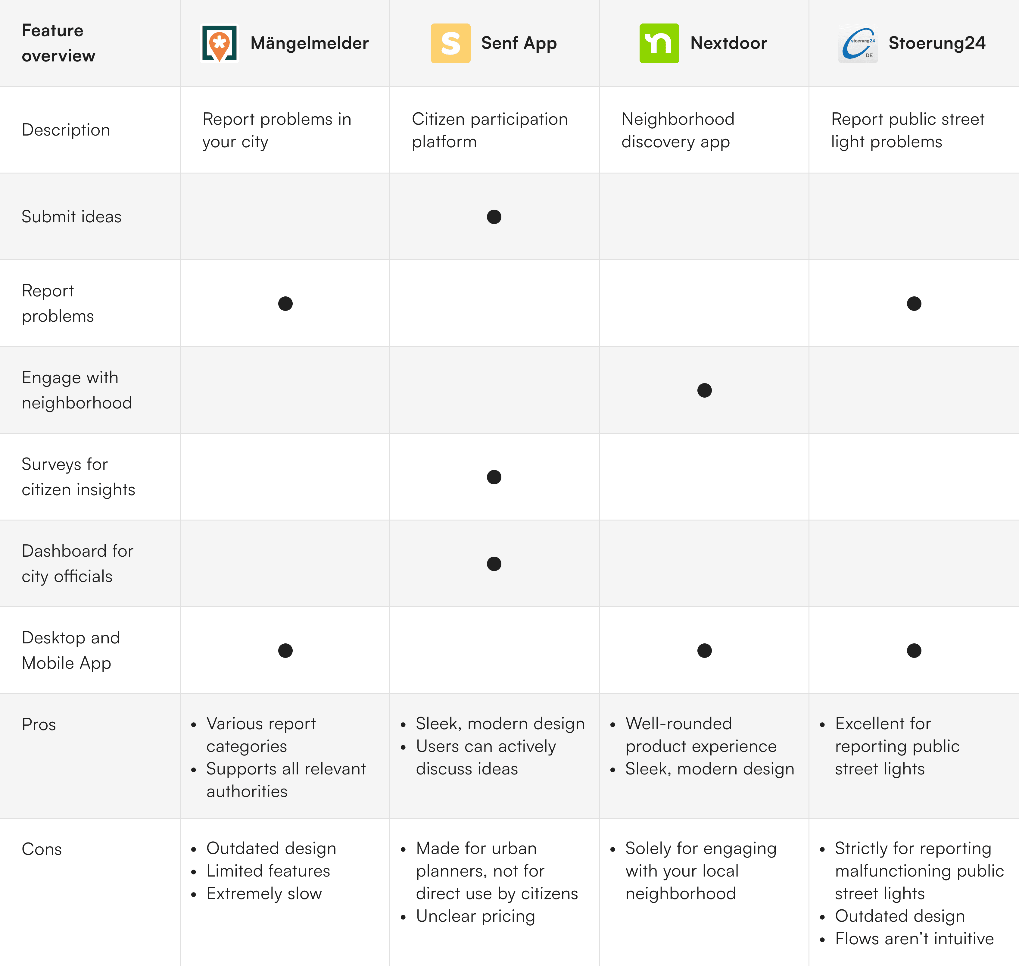
Analysing Market and Competition
The Challenge
Synthesis
User persona and user journey


Ideation
Through my research, I identified the product's most important features, which I prioritized from most to least important as the first step in the design process.
1
Reporting problems and tracking progress
2
Sharing ideas and collaborating with others
3
Visualized insights for city officials and urban planners
4
Anonymous citizen surveys for useful insights
5
Connecting with locals to strengthen neighborhood ties
6
Driving engagement through gamification
The "Reporting a problem" flow was relatively straightforward, until I faced this question: which form type works best in this scenario?
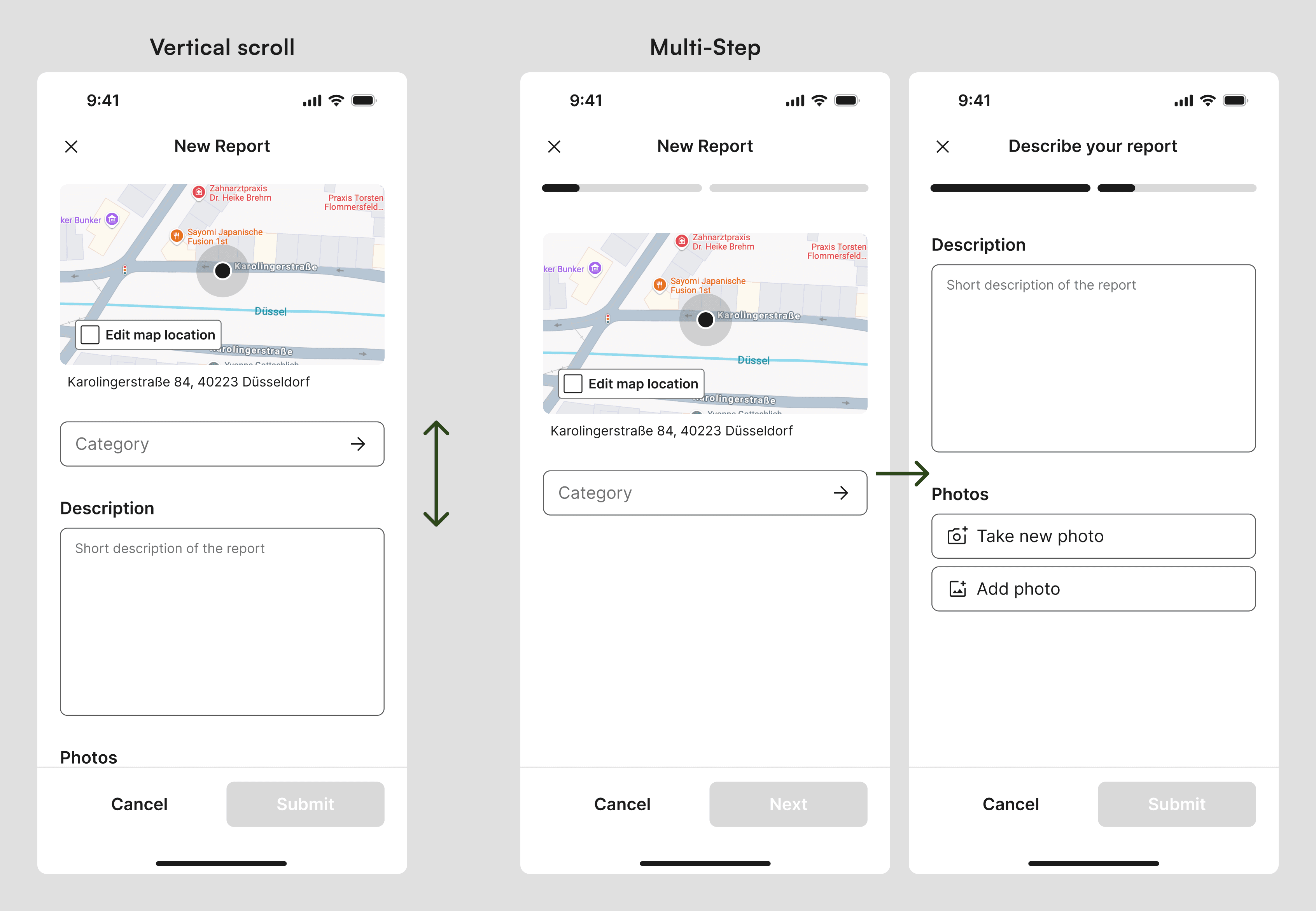
Vertical Scroll:
Users can view the entire form before starting
Showing everything at once increases cognitive load and can overwhelm users.
Multi-Step:
Lower cognitive load, users see fewer fields at once, making it less overwhelming
Users can't see the whole form upfront, so they don't know what to expect

The solution:
Multi-Step form with a twist. The clickable progress bar gives users the best of both worlds: preview the whole form without feeling overwhelmed by a long form.
Testing
Lowering the barrier to effortless user reporting
One of the key challenges was lowering the barrier for users to report problems and share ideas. I noticed that many users would drop off at the description form, and during interviews they often mentioned how annoying long forms were. In response, I implemented predetermined answer choices and an AI voice reporting feature to enable quick and easy submissions. Check out the voice feature in the Final design section.


Smoother navigation: easy back and quick Create
Users criticized that when they viewed an idea, they could only go back using the back button, instead of using the bottom navigation bar. Also, when they wanted to create their own idea, they had to go back to the previous screen to find the “Create Idea” button.
I addressed these problems by making two changes:
Added a “Create” destination to the bottom navigation bar that takes you to an overview where you can create any type of post. It is only highlighted when no other primary button is visible, preventing conflicts between main buttons.
Changed the “Ideas” destination so while users are viewing an idea, the destination is inactive and tapping it acts like a back button, making the navigation smooth and natural.
Accessibility considerations
While testing I was inspired to redesign some features to ensure every user can use them comfortably. This is one example.
If feedback is only visual, visually impaired users might miss order changes. While drag-and-drop can technically work with screen readers, it's often not practical. To improve accessibility, I designed two modes: one for drag-and-drop, and another using only tab navigation.
I also added privacy reminders to reassure users their data is secure and anonymous, leading to more valuable survey insights.
Summary
The problem
Despite widespread concern about city issues and many great ideas from residents, participation remains low. Citizens often don’t know how to get involved, feel like their efforts won’t make a difference or get frustrated by complex processes and lack of updates. This limits participation, leaving many voices unheard and preventing collaboration between citizens and local governments, which leads to unaddressed community needs.
The solution
Citify is an all-in-one platform that enables citizens to share ideas, report issues, and connect with their community. This empowers active engagement and ensures every voice is heard. For city officials and urban planners, it provides real-time feedback and visualized data, leading to quicker, more effective responses. Citify bridges the gap between citizens and city leaders, encouraging collaboration to make cities a better place for everyone.

Reflection
Takeaways
No hard stops
During the citify project I’ve learned the importance of keeping users in the loop. Eliminating hard stops ensures users always know what to do next, making the experience intuitive and frustration-free.
Next steps
New features
To make reporting even easier, I’m considering a few new features that need more exploring. One idea is to add a button to Maps, so users can quickly report potholes or faulty traffic lights while driving. Since drivers can’t safely user their hands, I’d like to explore a voice-activated option, letting people report hands-free on the go.
Marketing campaign
For the platform to really work, lots of people need to use it. That’s why the next step is a solid marketing campaign to get the word out and encourage citizens to join in and make their city a better place.